- Web制作
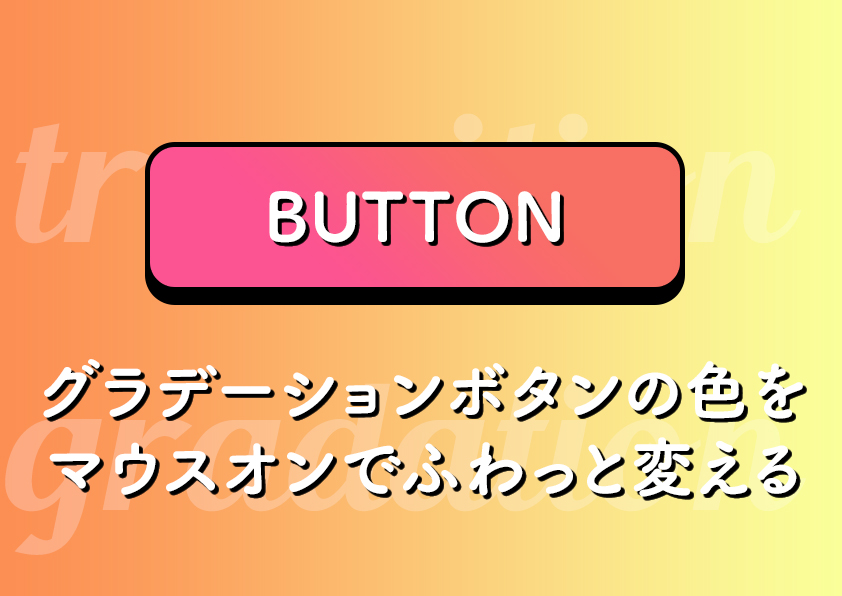
グラデーションボタンの色をマウスオンでふわっと変える
単色ボタンのデモ
cssで作ったボタンの色をマウスオンで変える時に、cssのプロパティtransitionを使うとふわっとゆっくりと色を変えることができます。
// HTML

<div class="btn btn1">
    <a href="">
        BUTTON 1
    </a>
</div>
// CSS

.btn a {
    position: relative;
    z-index: 0;
    color: #fff;
    width: 400px;
    height: 80px;
    display: flex;
    justify-content: center;
    align-items: center;
    font-weight: bold;
    text-decoration: none;
    border-radius: 10px;
    overflow: hidden;
    transition: 0.5s;
}

.btn1 a {
    background: rgba(0, 119, 255, 1);
}

.btn1 a:hover {
    background: rgba(252, 69, 123, 1);
}
グラデーションボタンのデモ(トランジションが効かない)
ボタンの背景色をグラデーションにしてしまうとtransitionの効果が効かなくなってしまいます。
// HTML

<div class="btn btn2">
    <a href="">
        BUTTON 2
    </a>
</div>
// CSS

.btn a {
    position: relative;
    z-index: 0;
    color: #fff;
    width: 400px;
    height: 80px;
    display: flex;
    justify-content: center;
    align-items: center;
    font-weight: bold;
    text-decoration: none;
    border-radius: 10px;
    overflow: hidden;
    transition: 0.5s;
}

.btn2 a {
    background: rgb(0, 119, 255);
    background: linear-gradient(90deg, rgba(0, 119, 255, 1) 0%, rgba(252, 69, 123, 1) 100%);
}

.btn2 a:hover {
    background: rgb(255, 0, 0);
    background: linear-gradient(90deg, rgba(255, 0, 0, 1) 0%, rgba(252, 176, 69, 1) 100%);
}
グラデーションボタンでふわっと色を変えるデモ
グラデーションボタンでもふわっと色を変えるには擬似要素を使うと便利です。
before要素に通常時のグラデーションを設定し、after要素にマウスオン時のグラデーションを設定します。
マウスオンした時にbefore要素をopacity:0;にして非表示にしてあげることでafter要素が出現してふわっとグラデーションが変化したような見た目になります。
// HTML

<div class="btn btn3">
    <a href="">
        BUTTON 3
    </a>
</div>
// CSS

.btn a {
  position: relative;
  z-index: 0;
  color: #fff;
  width: 400px;
  height: 80px;
  display: flex;
  justify-content: center;
  align-items: center
  font-weight: bold;
  text-decoration: none;
  border-radius: 10px;
  overflow: hidden;
  transition: 0.5s;
}

.btn3 a:before {
  content: "";
  width: 100%;
  height: 100%;
  position: absolute;
  z-index: -1;
  left: 0;
  transition: 0.5s;
  background: rgb(0, 119, 255);
  background: linear-gradient(90deg, rgba(0, 119, 255, 1) 0%, rgba(252, 69, 123, 1) 100%);
}

.btn3 a:after {
  content: "";
  width: 100%;
  height: 100%;
  position: absolute;
  z-index: -2;
  left: 0;
  background: rgb(255, 0, 0);
  background: linear-gradient(90deg, rgba(255, 0, 0, 1) 0%, rgba(252, 176, 69, 1) 100%);
}

.btn3 a:hover:before {
  opacity: 0;
}

名古屋の Web 制作会社で 9 年半働いた後フリーランスに。中小企業のWEBサイト制作実績 120 サイト以上。ディレクション、デザイン、コーディング、WordPress 構築まで手掛けます。Web制作に関わる情報やワーケーション日記などを執筆しています。